Fridgloo
Reinventing the way grocery shopping and cooking are handled through an all-emcompassing fridge hub app.
Overview
Fridgloo is an app designed to help users maintain the current content of their fridges and pantries in an all-in-one tool containing their personal refrigerator, grocery list, and recipe cookbook. Users can manually add items into their fridges or use the grocery list feature to directly add all they purchased on their grocery run. Based on the ingredients in their fridge, especially the ones about to expire, Fridgloo can recommend recipes in order to help reduce waste, encourage exploration of new recipes, and track food consumption.
Problem
Have you ever come back from grocery shopping and realized you had forgotten to buy more bananas? Or went to pour yourself a bowl of cereal only to see that the milk has spoiled? With so many other priorities and distractions in daily life, it can be difficult to stay on top of groceries. Busy professionals and students may find themselves forgetting what they have in the fridge leading to duplicate buys, food waste, and unnecessary money spent. This can be very frustrating due to the fact that the various aspects of food management are not in one central platform; the fridge, handwritten grocery lists, recipes from cookbooks or online, are all separate entities. This creates disconnect and inefficiency when they should be working in tandem.
The Team
- Sungbin Jeon
- Daniel Yun
- Will Lee
- Ashley Sidoryk
- Enok Choe
My Role
My main focus was working as a UX/UI Designer and Frontend Developer.
The Goal
Create an efficient tool to help users keep track of their grocery shopping and food management.
Research
In order to get a better understanding of the purpose behind our app and its potential demand, we began discussing our own troubles with food management. To bolster our opinions further, we also did research on data behind average food consumption and waste to see if Fridgloo could really make an impact on this issue.
Personal Experience
As college students ourselves, we know firsthand the struggle of balancing life and school. Especially as upperclassmen who have our own kitchens, cooking our own meals becomes default. And yet, prioritizing school work compromises the time we can put into something even as important as eating. Thus, we need quick and easy accessbility when it comes to meal prep and execution. The constant worrying of the next exam, work shift, club meeting, and so on can also cause the mental note of the bread going bad in two days to completely slip from mind. Specifically for me, I have had one too many disappointing encounters of opening the fridge to expired produce and spoiled leftovers. Therefore, our busy work schedules could use the aid of something like Fridgloo.
Stats
According to the U.S. Department of Agriculture, food waste is estimated at 35% of the food supply which occurs for many reasons such as spoilage and overbuying. Approximately every year 219 pounds of food per person is wasted, making the average household throw out about $1,600 in food per year. Consumers contribute to a large portion of food loss when expiration dates are not carefully considered and they buy or cook more than they need which all leads to the disposal of these foods. These were issues that we had taken into account and with the data backing up our stance, it is clear how our app can act as a minor solution to a major problem. Fridgloo can help reduce spoilage waste by keeping track of the expiration dates of users' groceries and reminding them when these items are about to expire so that they can avoid being swept to the trash. It can also help with portion control and saving money as following recipes provide a more accurate representation of how much to exactly buy and use at a time as well as giving people inspiration on what they can cook based on ingredients they already have in their fridge.
Ideation
Our goal was to create an app that is accessible to everyone that not only incorporated all the necessary features, but also one that prioritized usability. An issue we recognized was the huge disconnect between the various tools utilized when it comes to this particular chore. We want users to feel more in control of their groceries by providing them with an easy to use, all-encompassing platform.
Proposed Ideas
We focused heavily on the brainstorming process as we knew that this app would contain various distinct major features that would need to be seamlessly connected. Collectively we formulated a simple outline of the framework we wanted our app to be based upon. We concentrated on the most basic purposes and functionalities we wanted to achieve before discussing the more complex features as they would be built off this foundation later on.
-
Fridgloo
- food management system
- idea of a "fridge hub"
- encompassing all features onto one platform
- aim to help make groceries easier
-
Registration/Login
- Provide name, email, password
- Form verification
- database needed to store account information
- SSO authorization?
-
Fridges
- users can add items into fridges
- can click into each to view what items are inside
- can edit what items are in fridge to be up to date
-
Grocery Lists
- create as many lists as user needs
- lists are editable at any time
- can be checked off while shopping
-
Food Expiration
- can manually add expiration date when adding to fridge
- alert (push notification)
- banner on top of ingredients for warning
-
Recipe Functions
- lookup via keyword / ingredient matching
- recommend recipe based on items
- add own receipes and share?
-
Database
- storing username and password
- associated fridge and contents
- created grocery lists and contents
- database of receipes: create or API?
-
Algorithm
- based on food item keyword search
- the more keywords a receipe contains, the more priority
- sort into catergories based on tags?
Concerns and Solutions
As Fridgloo has multiple larger main features, this can complicate the overall user experience. As ease of use is integral to our model, our focus was on identifying these potential roadblocks that may arise and the ways in which to tackle these issues.
- Usability: With having the fridge hub, grocery list, and receipe features being the main componenets of our service, we created distinct separate sections for these main features. We created a navigation bar with tabs that lead to each feature to not only avoid a usage conglomeration, but also for visual distinction.
- Multiple Fridges & Lists: Users can have more than one fridge so in order to keep more organized, they can create as many fridges as they need. Along the same lines, they can create multiple reusable lists as users tend to get different items at different places and shopping trips are usually repeative by nature.
- Grocery Shopping Items: Manually having to add new items from shopping trips that were already written down on grocery lists is inefficient; therefore, we created a button that sends all items in a list that were purchased directly to a specific fridge.
- Recipe Usage: Though a main component of the app, it can be considered more of a secondary feature when compared to the fridge hub, thus making it vunerable to being overshadowed. To combat this, we created a link between the two features by having receipe recommdations based on expiring items.
Design
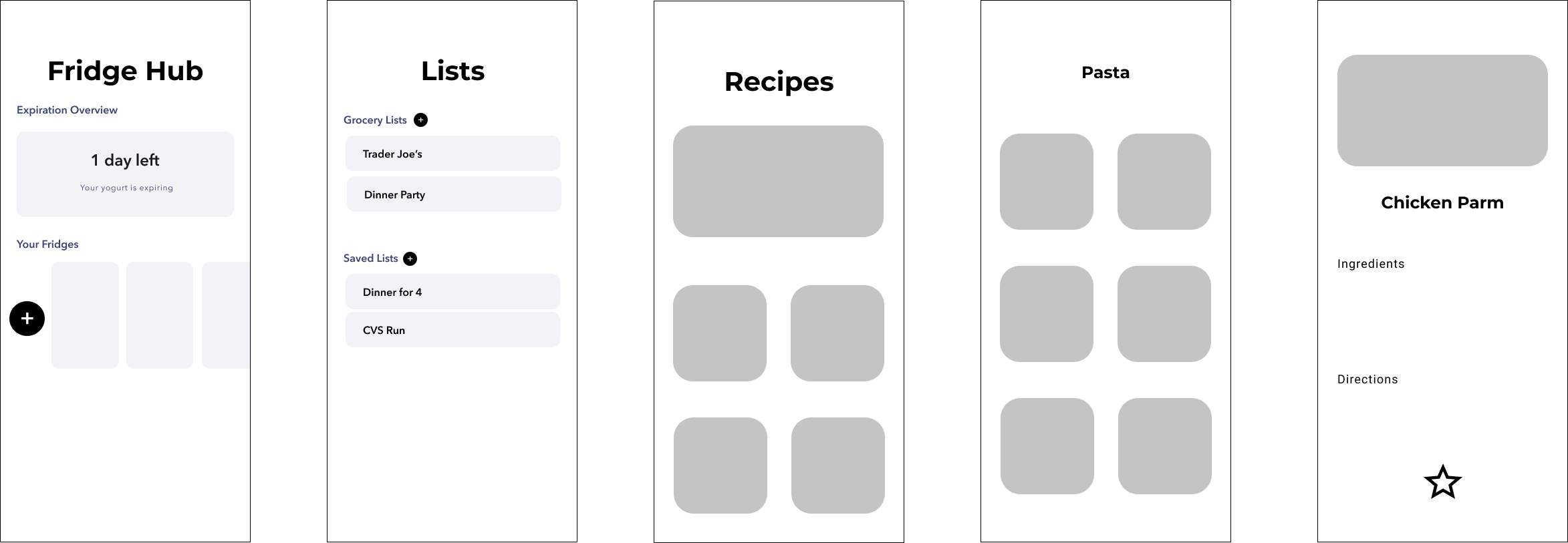
To kickstart our design process, we designed a skeleton of some of the main screens of Fridgloo. We decided to begin with the fridge hub and lists portions as they were the most important aspects of the product.

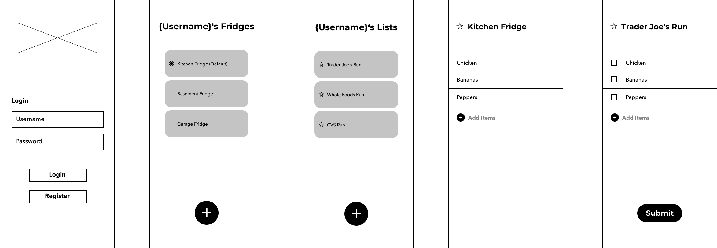
Only taking into account the most basic funtionalities that these features required, we wireframed these working parts. As both the fridge hub and lists are capable of having more than one main component, we wanted these screens to clearly display all the fridges and lists a user may have as well as show directly that they may add as many as they need. We carried this same idea over to the screens that show the content of each fridge and list by allowing users to add onto these lists at any time even after initially creating them. The submit button in the list screen allows users to submit those items into their fridge for easy updating purposes.

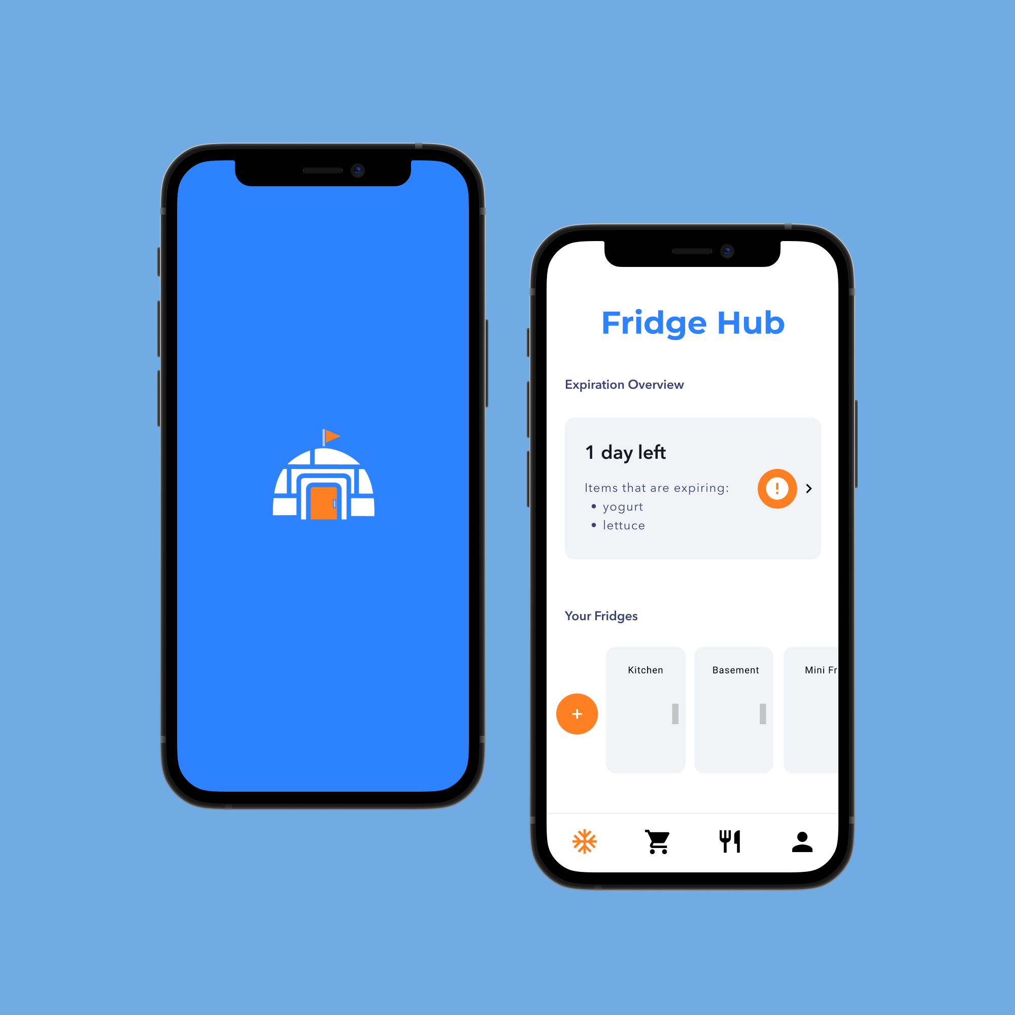
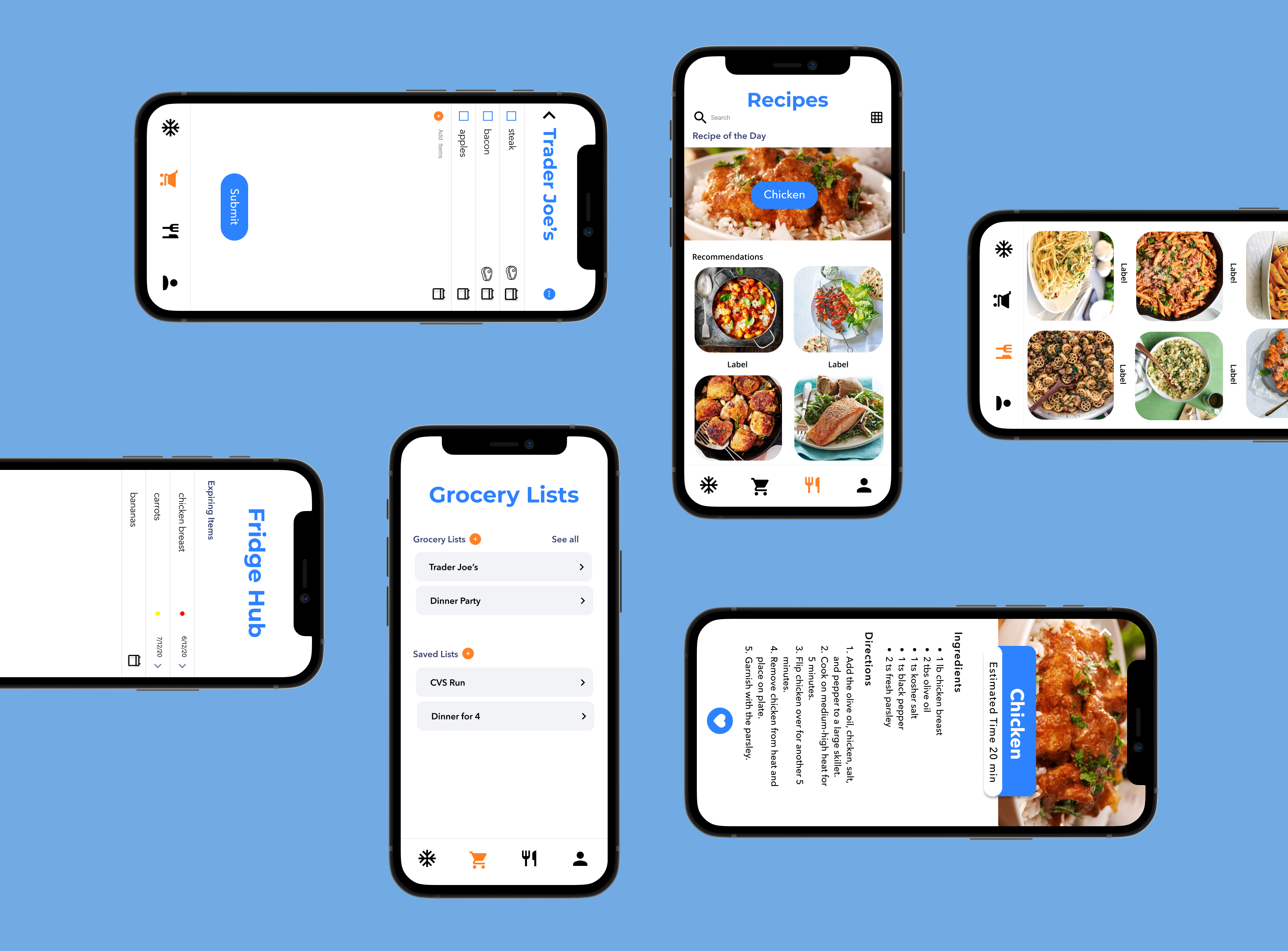
We wanted to improve upon the look and usablility of the features on the fridge hub portion of the screens as they were tooo bulky and after more design iterations, we came up with our final design. As the expiring food reminder was a vital detail, we decided to put it at the top of the screen to enhance its significance. We also thought that making the different fridges resemble actual fridges would be a fun additional detail. After these finalizations, we moved onto the recipe feature. This portion of the app was one we wanted to keep as simple as possible since it would be containing a lot of content and infomation. As recipes contain both pictures and thorough instructions, we did not want to take away from this with distracting over the top design. Through more iterations and further refining the interactivity and logical flow of our app, the MVP for Fridgloo was created.

Project Learnings
This project is comprised of many functionalities which proved to be a much bigger task than we had originally conceptualized. The purpose of our app is to dissapate the disconnect and complications by bringing everything together onto one platform; therefore, streamlined and straightforward interactions between features was extremely significant for us to achieve as this was the foundational priciples we had when writing our problem statement. A next step that could be taken is to conduct user testing to see what more can be enhanced and produce additional advanced features such as fridge sharebility within a household so that updates can occur in parallel.
Key Takeaways
- The more user research, the better the results! Though personal experience is always telling, it does not encapsulate everyone's perspective. For more improvement, a survey should be created and sent out to gain more opinions in order to quantify the need for this app as well as what can be included to create a better experience for our users. In order to create a product that is best fit for our customer, taking their insight into account is essential for success.
- Having many features shouldn't compromise usability! It was a little difficult to balance all the features we wanted to include without having one compromise another. This showed the importance of the design process as it helped us visualize and fully consider the interconnectivity within the app. Mapping out what was needed and which path was the most user friendly not only prevented us from getting confused, but ensured that our users would have no issues when using Fridgloo.
Citations
- “Food Waste FAQs .” USDA: U.S. Department of Agriculture, https://www.usda.gov/foodwaste/faqs.
- “Food Waste in America in 2021: Statistics & Facts: RTS.” Recycle Track Systems, https://www.rts.com/resources/guides/food-waste-america/.
- Cooper, Ryan. “Food Waste in America: Facts and Statistics.” Rubicon, 25 Aug. 2020, https://www.rubicon.com/blog/food-waste-facts/.